GM Live Experience
Role
UI / Prototype
Brand
General Motors
Year
2025
My role in this project was to design all mockups and prototypes, and to manage the UI Kits across multiple brands. This work was grounded in an analysis of business goals and user needs, gathered through usability testing, for each brand within GM Live Experience, a live streaming tool that connects users with specialists to explore each brand's vehicle lineup in depth.
The GM Live Experience
GM Live Experience is General Motors' virtual showroom, where brand specialists (Chevrolet, Cadillac, Buick, GMC, and GM Energy) guide customers through each model in the automaker's portfolio. Users can interact with specialists through live video and chat, asking questions and receiving answers in real time. The experience is designed to deepen the user's connection with the brand and nurture them into a potential car buyer.
User Flows
The entire user experience was built around a detailed user flow that supported multiple entry points: direct access, scheduled sessions, and email invitations, each generating its own set of paths and edge cases. The flow grew even more complex at the end of the experience, where the approach shifts: users are guided into a shopping funnel and moved toward closer, more targeted communication with the brand.
Design System
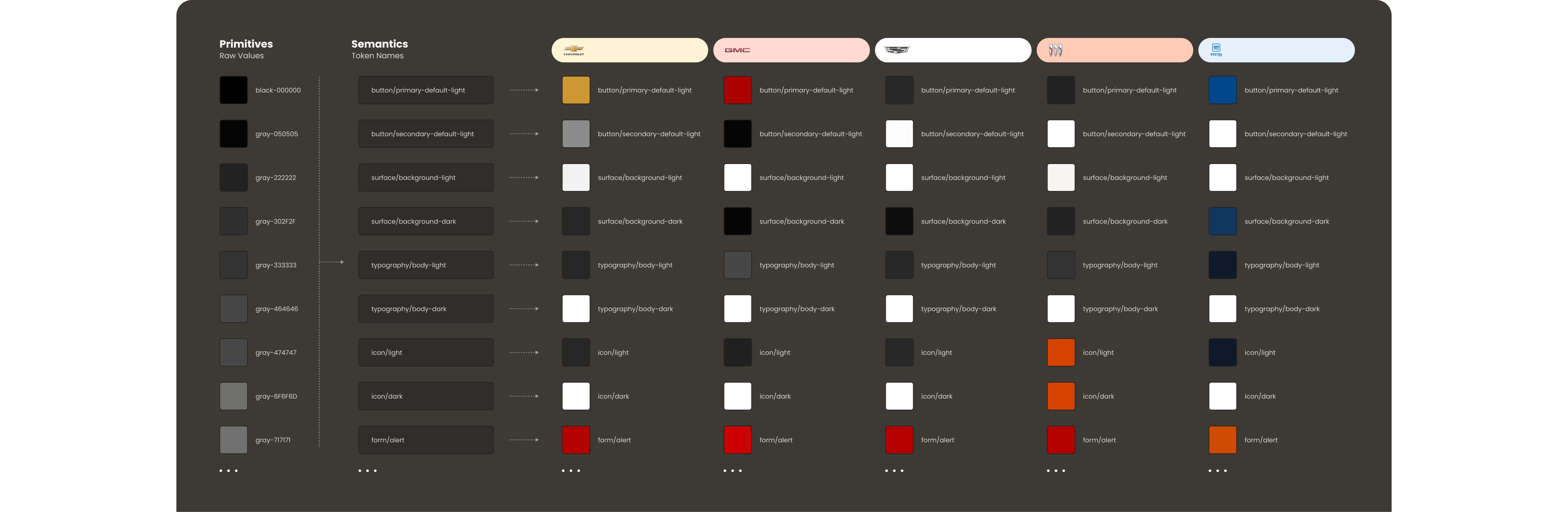
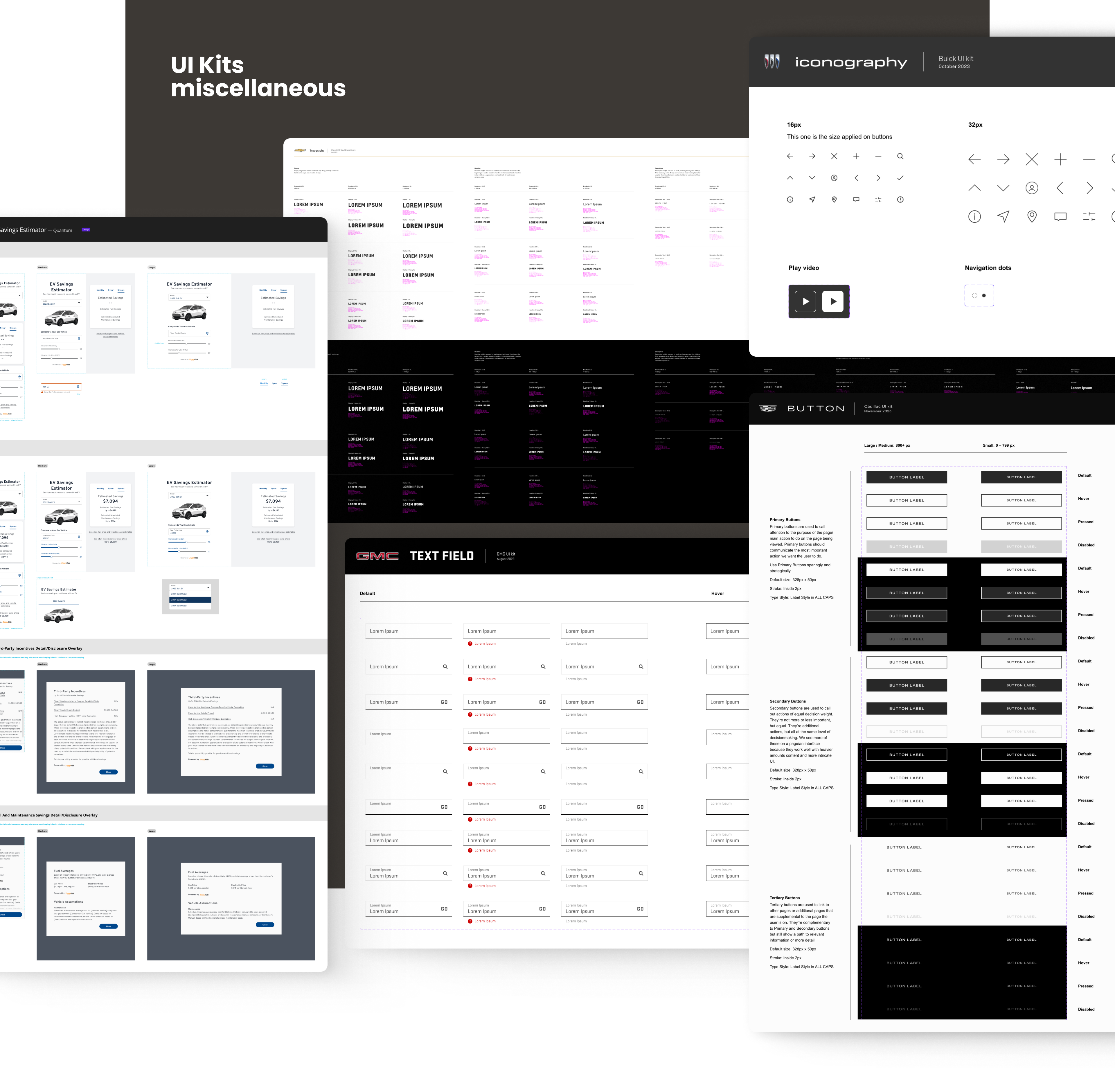
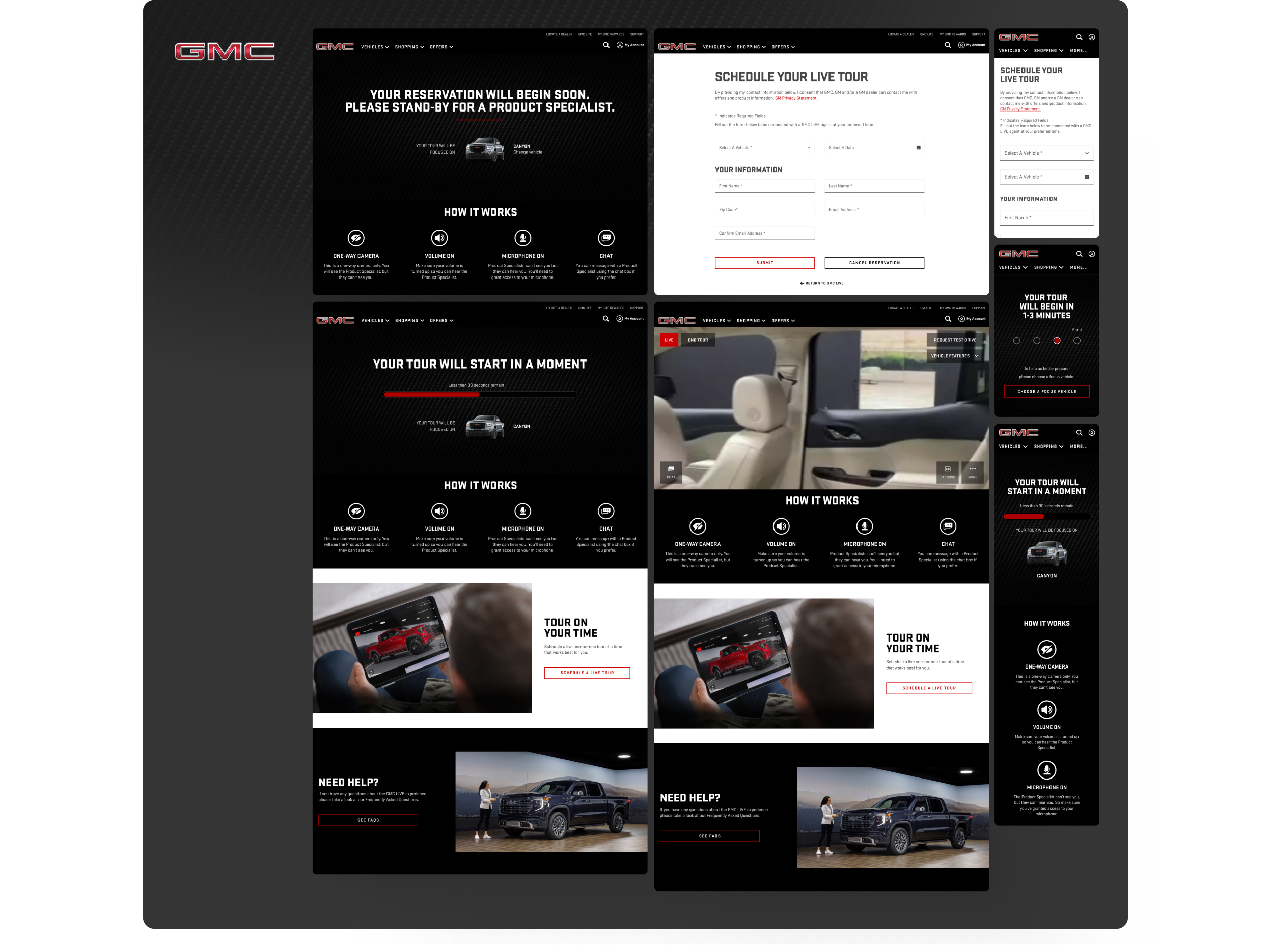
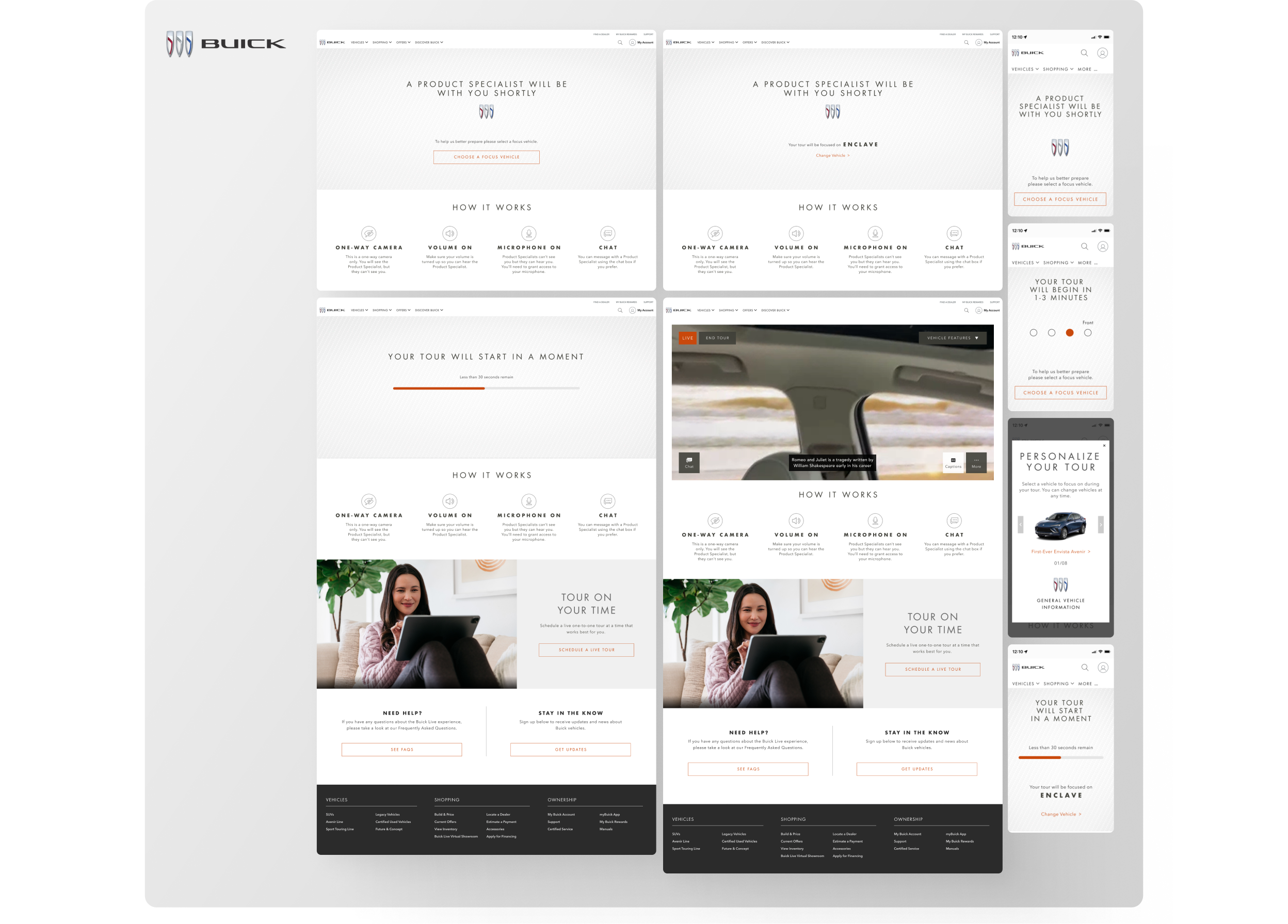
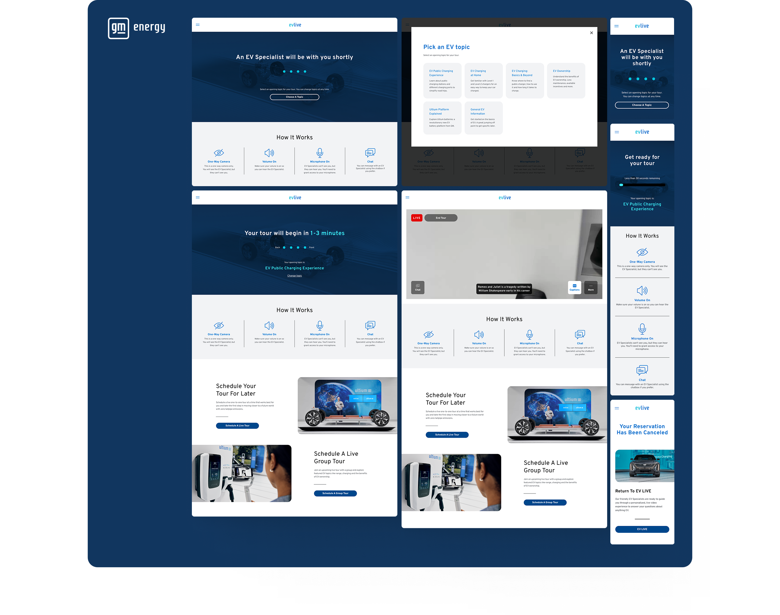
The GM Live Experience pages existed as separate websites and iframes embedded within each brand's .ca websites, and the design systems for these two products were entirely disconnected. One of my most important contributions during this period was creating and managing the UI Kits used by our internal team. Before this work, design components were broadly inconsistent, and collaboration with developers and the .ca teams involved significant friction.

I began by implementing UI Kits that reflected the visual foundations and components already established on each brand's .ca website, then layered in the exclusive GM Live Experience components built specifically for our product. I also monitored updates to the .ca Design Systems on an ongoing basis to keep our kits in sync.

Since the brands shared many foundational styles, I created a shared variables file covering colors, font sizes, spacing, and corner radii. Each brand's UI Kit was then linked to this foundation file, ensuring all components were built consistently from the same shared base.
Mockups
The complexity of the user flow required producing a large volume of mockups, each adapted to the specific business goals and user characteristics of individual brands. I also supported the UX research team by building prototypes used in usability testing sessions.
Appendix — Implementing Closed Captions
Toward the end of my time on GM Live Experience, the team took on an additional challenge: integrating closed captions into the platform. Given that the product already served users across multiple brands with distinct visual guidelines, this feature added a meaningful layer of accessibility to the live streaming experience.

The project introduced a set of constraints unlike anything in our typical design workflow. Captions had to be generated in real time, with a high standard of accuracy to avoid potential legal issues from misspelled words, and adapted to the desktop viewport across all GM brands.
Our process began with a benchmark of leading video conferencing platforms like Microsoft Teams, Google Meet, and Zoom, followed by in-depth desk research focused on accessibility best practices. The key design decisions that came out of this work were:
Character count and layout.
We targeted around 60 characters per caption block, split across two lines of slightly different lengths to make scanning and line-skipping feel natural.
Justification.
With a single specialist as the speaker, we opted for centered text, which creates a more fluid reading rhythm between lines.
Typography.
Non-serif typefaces were prioritized for screen readability. When a brand's visual guidelines didn't meet this requirement, we defaulted to Arial or Helvetica, placing user needs above brand aesthetics.
Font size.
Caption text should not exceed 8% of the screen height. For our desktop viewport, this translated to 18px as the optimal size.
Color and contrast.
We used a fully black background at 85% opacity with off-white text, ensuring a strong contrast ratio even when overlapping light surfaces, and remaining accessible for users with color blindness or dyslexia.
Customization.
We included a text size adjustment tool, recognizing that a single default setting cannot meet every user's needs.
This project reinforced that accessibility decisions made for a specific feature often carry principles that strengthen the entire product. The full breakdown of our research and design process is available in the original article on Medium: Implementing Closed Captions
Projects